Richart Design System • Shipped 2023
From an Outdated Docs to a Token-Driven Design System
Introduced design tokens and rebuilt documentation to improve consistency of component usage and align design-dev handoff.
ROLE
Lead UI Designer
TIMELINE
4 months, 2023
TEAM
1 Project Manager
1 Senior UI Designer (me)
1 UI Designer
2 Developers
PROJECT TYPE
Design Systems
Design Token
Fintech
WHAT I DID
• Led development of design system principles and governance to ensure consistency and scalability.
• Created and maintained new component library, including versioning control and documentation.
• Introduced design tokens and educated the team to understand and adopt them.
OUTCOME
After the design system revamp, I documented 12 core UI components and continued maintaining it through three months of product iterations. UI inconsistencies dropped by 66%, and component reuse increased to 80%. And also Implementation became smoother with less adjustment, and kept stakeholder discussions focused on core product decisions not UI mismatches.
BACKGROUND
This gap is where design systems revamp starts. Durning the Richart app redesign and brand refresh, I tackled an outdated system with fragmented documentation that led to unclear component usage and frequent design–dev mismatches.
PROBLEM
Outdated and fragmented documentation made the system hard to use and difficult to implement consistently.
When teams focus on immediate needs, it’s easy to create one-off designs. Over time, the guideline collect more and more exceptions. With unclear guidance and no common language between design and development, the system became hard to use and easy to interpret differently. In the user side, this led to inconsistent interactions, higher cognitive load, and lower brand trust.

Outdated and disorganized documentation
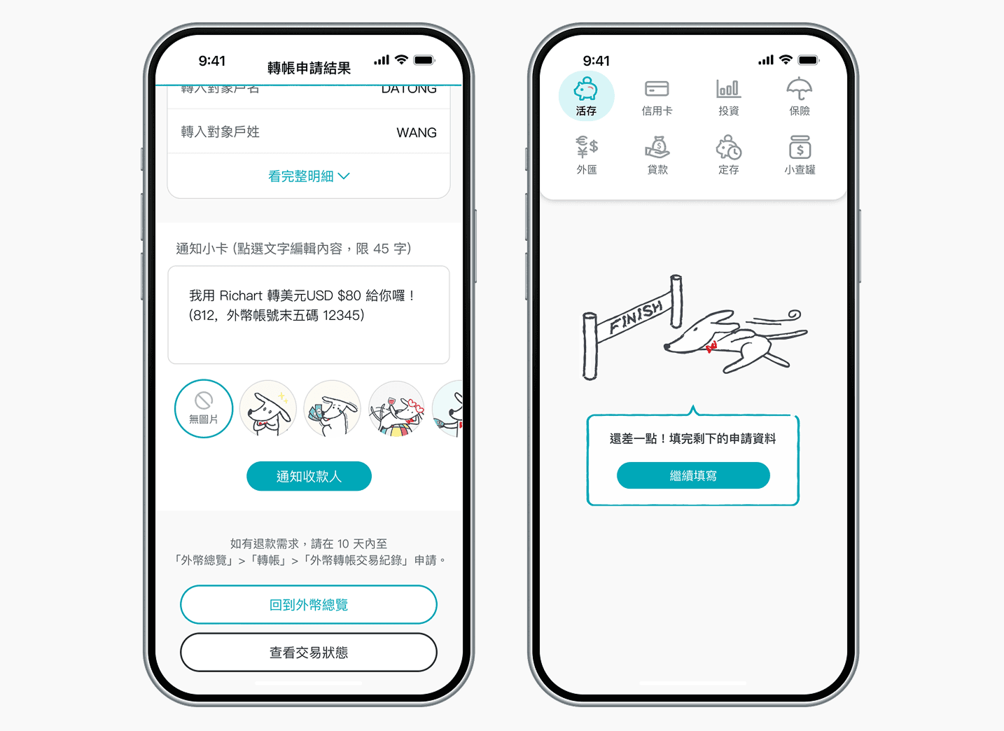
Same component, different interaction level.
GOAL
Build a scalable design system, and maintainable documentation for consistent delivery.

View the design system as a long-term team asset and align PMs, designers, and engineers with a common language for smoother collaboration.
DESIGN PROCESS
Structured design system revamp into four phases: Discover, Define, Build and Scale.
This project wasn’t just about producing a set of guideline or refreshing the visuals. The most important thing is to build a system that could be consistently adopted, maintained, and evolved in real product scenarios.
DISCOVER • BENCHMARK RESEARCH
Understanding design system benchmarking
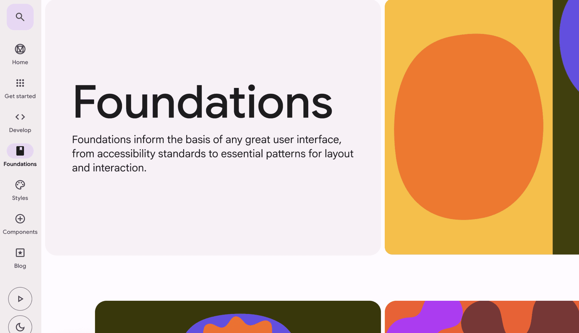

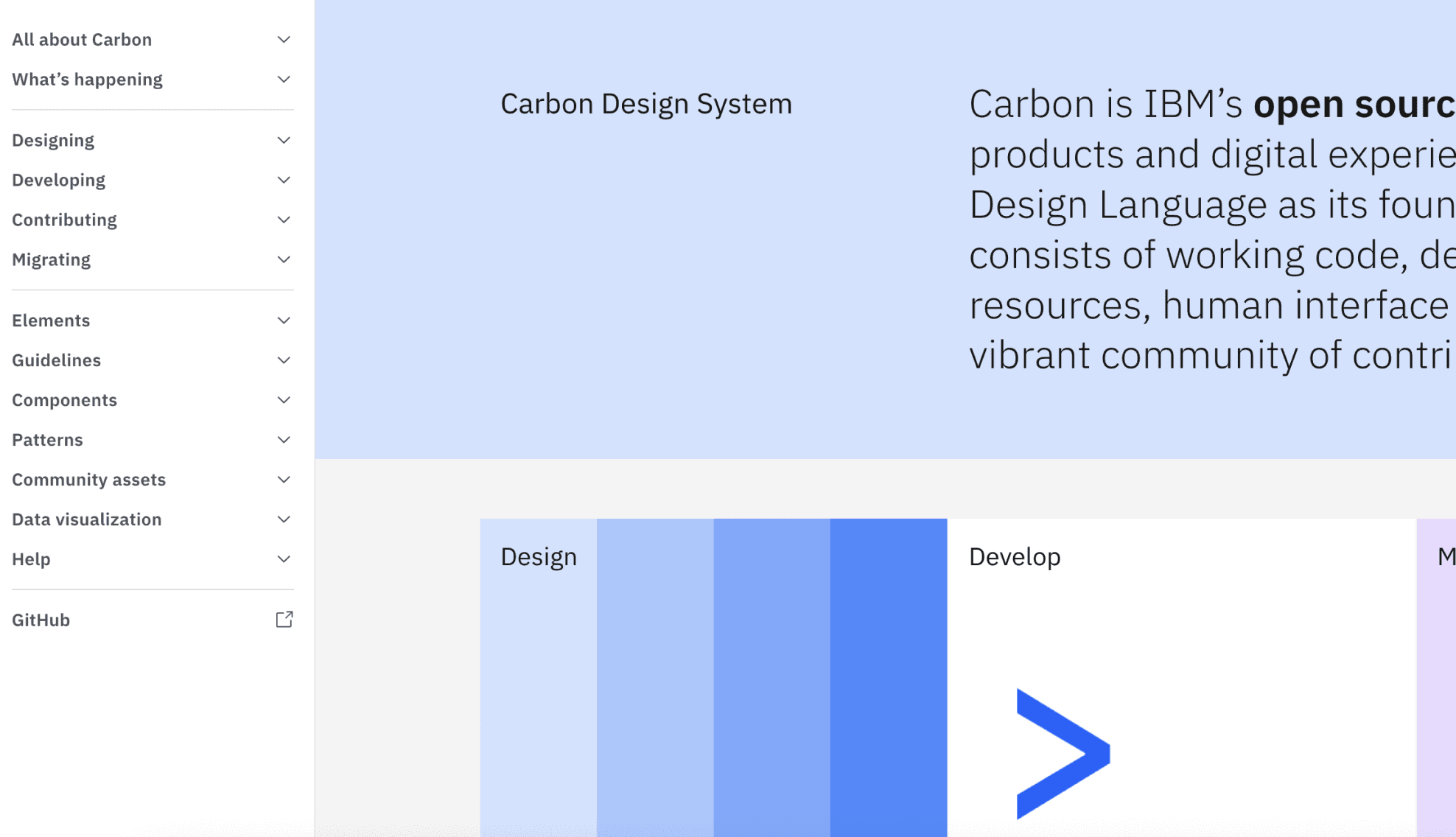

Durning the early research phase, I studied benchmark on design systems from various companies and financial products, such as Google Material, IBM Carbon, Ant Design and Visa design systems. To understand how they define components, structure categories, and name design tokens. From this, I learned that:
Design systems are living languages, not a static rulebook
A design system must evolve to fit new interactions and real use cases, with flexibility built into the foundation.
Start simple, then refine
Token naming doesn’t need to be overly detailed in the beginning; with a clear logical foundation, it can be refined over time.
1. DISCOVER • STAKEHOLDER INTERVIEWS
Aligning needs and defining core design principle
I interviewed 3 designers, 1 PM, and 1 engineer to understand cross-functional needs and pain points, then synthesized them into core design principles to establish alignment from day one.
Clear
When documenting, prioritize plain language and unambiguous specs so new designers can use it quickly without interpretation.
Approchable
A design system should be easy to use, aligning PMs, designers, and engineers through clear guidance and a common language
Scalable
Built on reusable components, so the design system can grow with new features while staying consistent and maintainable.
2. DEFINE
Synthesizing insights into a phased strategy for execution

Prioritized high-usage components for the first version
To reduce inconsistency as much as possible. I scoped the revamp based on time and resources, focusing on foundational, high-usage components first.

Established a clear navigation framework for the design system
Having a clear navigation and content structure so designers could quickly find the right components, guidelines, and foundations without digging through fragmented docs.

Introduced tokens systems for smooth handoffs and design-dev alignment
To enable consistent implementation, I introduced token systems to the project and keep tokens simple with a maintainable hierarchy and standardized docs so that teams could apply specs with less interpretation.
BUILD
How I put the strategy into practice
With the scope and documentation structure defined, I moved into execution by auditing components and implementing token naming to support handoff consistently.

Audit and rebuild the component library
I audited the existing library, removed redundant and inconsistent patterns, and rebuilt it into reusable components.

Create a token naming formula
There’s no one-size-fits-all token system. I started with Primitive and System tokens and created a clear token naming formula the team could follow. This made tokens easier to understand and extend as the system scales.
4. SCALE
Creating the design system documentation and governance
To scale the design system beyond a one-time rebuild, I created a documentation template and set up a lightweight iteration workflow. This gave teams a shared source of truth, reduced interpretation, and created a clear process to request updates and keep components and tokens evolving without fragmenting again.

Establish a clear guideline structure
I developed clear guidelines on anatomy, component usage, and when to use each variant, so designers can understand them quickly and the design system stays consistent and easy to maintain.

Develop an iteration workflow
I worked with PM, designers, and engineers to build a structured workflow for maintaining the design system, so future the team can manage it without friction
REFLECTION