Richart Explore Page • Shipped 2023
Building from 0–1 to make offers discovery effortless
ROLE
TIMELINE
TEAM
PROJECT TYPE
WHAT I DID
• Introduced a social-interaction pattern to a banking app to help users browse and discover offers more naturally.
• Created a reusable Stories toolkit (guidelines + templates) that enabled the marketing team to publish campaigns faster and more consistently.
• Conducted 6 usability tests with User Researcher and UX Designer to improve experience.
IMPACT
The Explore launch reached an adoption rate around 3.6% in the first few weeks. Beyond adoption, Explore drove a 5% click-through rate to other product pages among Explore visitors, strengthening the discovery-to-product funnel and making product exploration clearer and more intentional.
3.6%
5%
PROBLEM
Users couldn’t easily find offers or feel motivated to choose the right product.
Offers and product information were scattered across the app, making discovery inconsistent and product highlights easy to miss across key moments before purchase, after purchase, and in everyday use. On the business side, they need a more streamlined operating model and clearer cross-functional communication to support ongoing product growth across product, marketing, and operations.


SOLUTION
A hub for the latest offers and product updates, with engaging interactions that spark exploration
RESEARCH & STRATEGY
Users need personalized, contextual information to understand product value and feel confident taking actions
After eight in-depth user interviews, I collaborated with a UX researcher to synthesize the findings into a hierarchy of experience needs, translating them into clear opportunities for Richart.
KEY INSIGHTS:
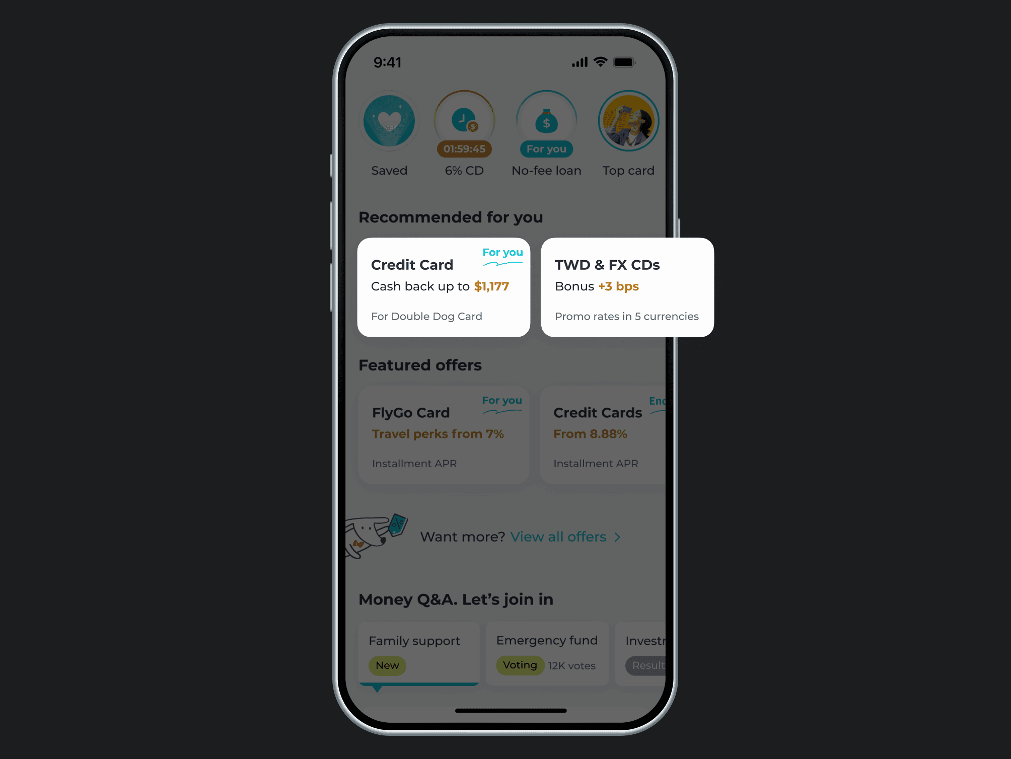
1. Only “made for me” recommendations earn attention
Users expect the homepage to find the latest offers, but most offers get ignored when they feel generic. Personalized recommendations help users quickly see value and engage.
Users won’t explore without clear value and next steps
Even when users land on a promo page, they drop off if they can’t quickly understand the value, how it fits their situation, and what to do next. Without clear connections across products, users struggle to extend their money and often don’t return to explore later.

Usability and relevance are the baseline. To truly differentiate the experience, inspiration and guidance matter most. Based on this, we framed the following HMW question:
DESIGN PROCESS • INFORMATION ARCHITECTURE
Restructured the app architecture to clarify the core purpose

DESIGN PROCESS • IDEATION
Discover what’s new with personalized, engaging interactions
I brainstormed with a UX designer to shape Explore into a fresh, discovery-first experience. The idea was simple: users don’t open Explore just to browse. They come for what’s new, limited-time offers, and a clear path to explore categories, so we designed an experience that bridges these needs and shift Richart from a set of separate touchpoints into a more connected, living financial ecosystem.
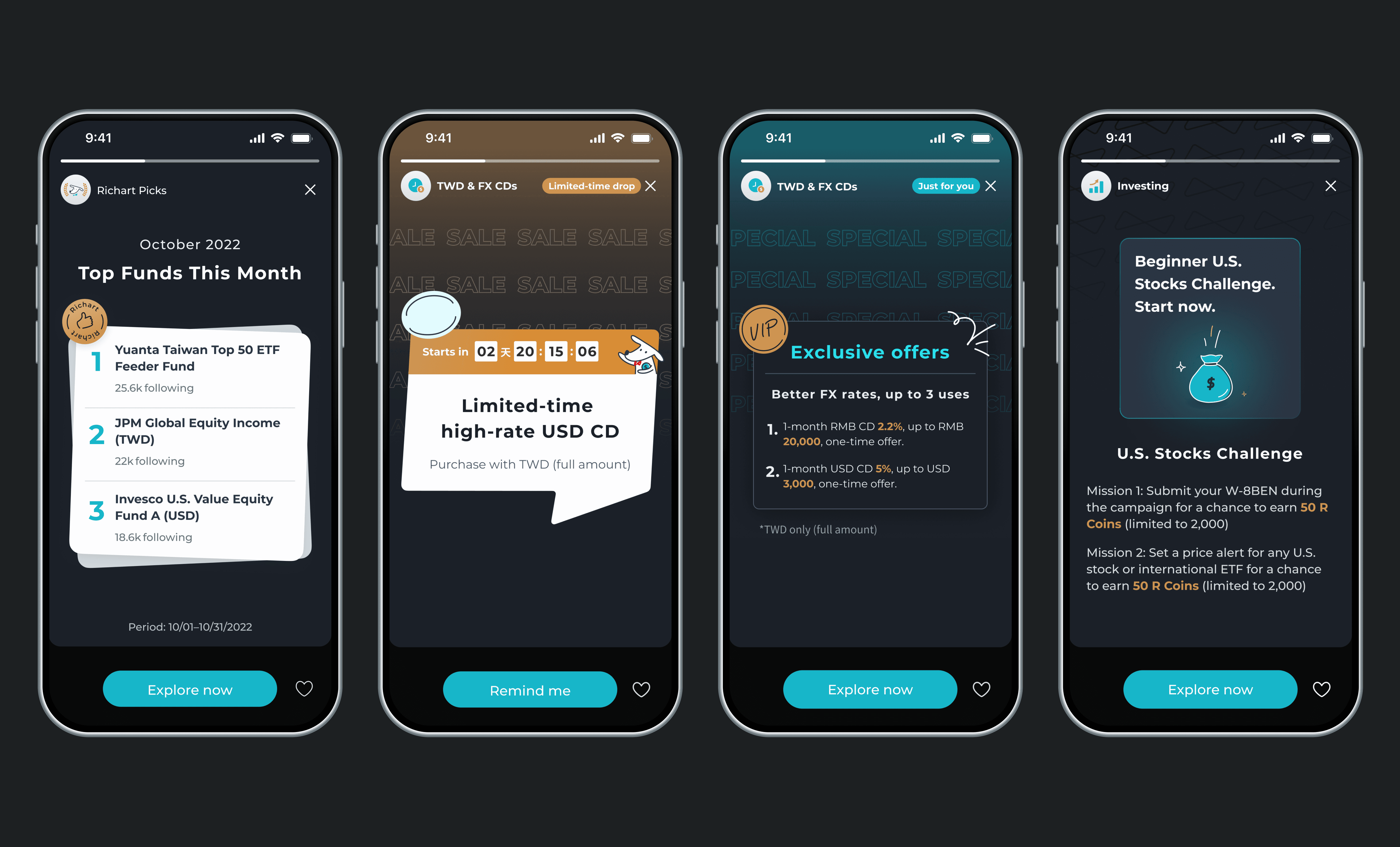
Stories for limited-time offers
A story-style element highlights new and limited-time content at a glance, making offers quick and easy to discover with simple swipes.
Personalized product recommendations
Recommendations adapt to what users already own and suggest relevant next steps, helping them discover products that fit their current needs and future plans.
Product comparison and rankings
Ranked comparisons organize key product information so users can quickly evaluate options and find what matches their goals.
Community engagement section
Missions, giveaways, and Money Q&A make the experience more fun, keeping users engaged and giving them a reason to come back.
USER TESTING & ITERATION
Validate ideas and iterate with users feedback
To validate these ideas, I collaborated with a UX researcher and a UX designer to ran a user testing, gathered feedback, and uncovered a few new insights. Those findings shaped the adjustments to the final design.
Insight 1: Personalized offers don't feel personal enough, User notice numbers first, not the copy
💡 SOLUTION…
Made the product value instantly scannable
Highlight key numbers with color and add a “For you” tag, then shorten card content so users can spot the benefit and tap faster.
Insight 2: In-app product rankings are not compelling. Users still compare across banks using external sources
💡 SOLUTION…
Shifted rankings into Stories to keep the Explore page lightweight
Remove the ranking module and move product picks into Stories, so Explore stays clean, fresh, and more personal.
Insight 3: Missions and giveaway entries feel generic, so users ignore them. Q&A works only when it resonates
💡 SOLUTION…
Made Q&A relevant and quick to answer
Turn Q&A into quick voting on relatable money topics to encourage participation and naturally connect users to related products.
CHALLENGE
One more big challenge in design handoff !
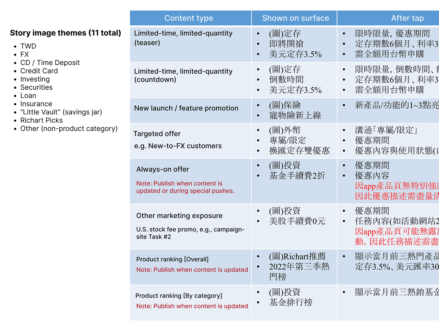
Without a dedicated design team, how can Marketing quickly publish and maintain Stories campaigns in a consistent way across different offer types, such as limited-time offers, limited-quantity offers, and partner offers ?

💡 SOLUTION…
Stories templates across 4 categories with 7 reusable tempaltes
I mapped offer types and separated standard type from special type, then built clear templates and guidelines so marketing team can publish Stories faster while staying flexible and consistent.

REFLECTION